
And I Quote…
From last Friday’s Noted post on Sentry, it turns out there is a lot more to the story that wasn’t available for release. Here is a follow-up on the new identity from Futurebrand with plenty more images and concepts behind it.
Sentry realized its brand was not an accurate reflection of who they really were and how they conducted business. The ideas of strength, protection and vigilance were table-stakes in the insurance industry. And the image of a solitary military figure holding a gun felt counter-intuitive to a brand whose core strength was found in the expert conversations it had with customers and the relationships it cultivated. The company’s identity felt too corporate, conservative, sometimes cold and out-of-step with the times.
Futurebrand provided text
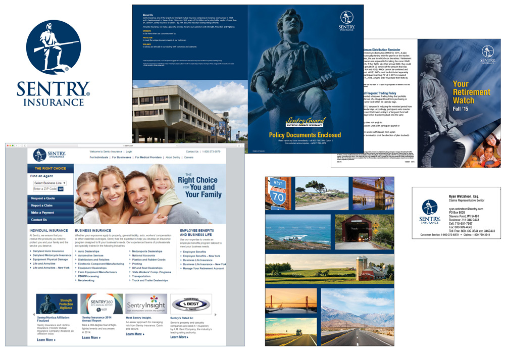
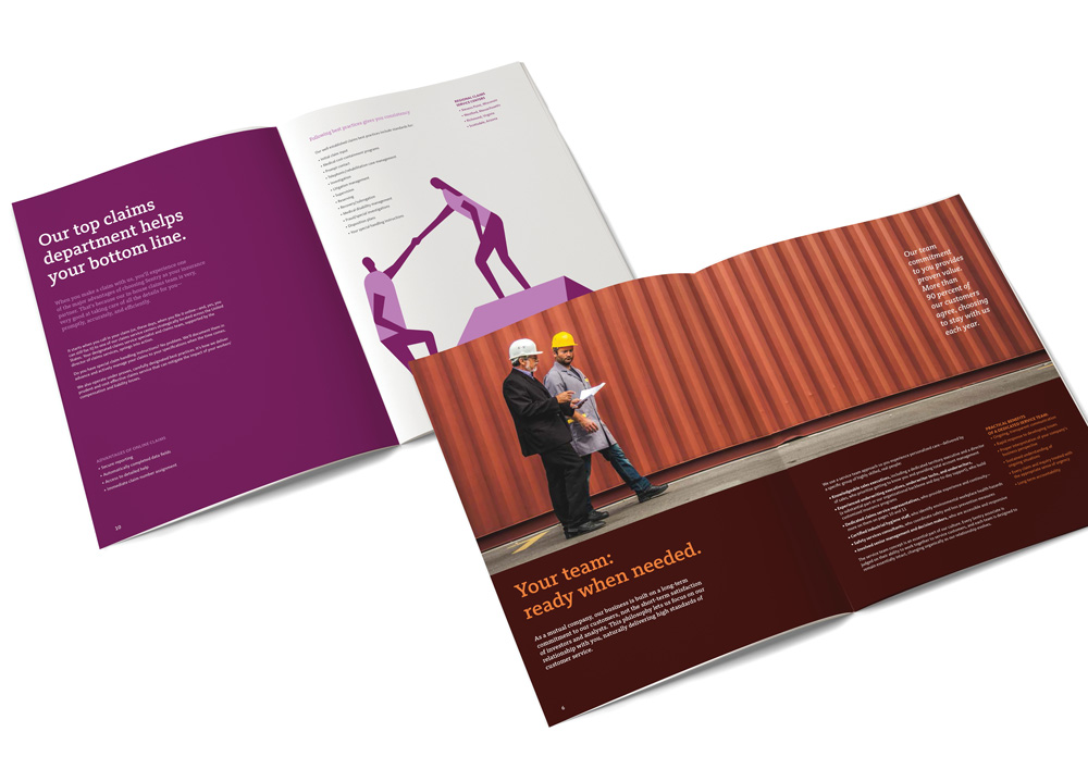
So the white man with a gun is not just a random white man with a gun but Captain John Parker, who “rallied 77 fellow minutemen to face British troops in the first military encounter in America’s War for Independence” and represented the values of Sentry, “Strength, Protection, and Vigilance.” That’s a good back story for a logo but as the image above shows, not much of that was reflected in the materials that looked like default insurance materials. Also, anything with a page-curl effect has to be deleted from existing.
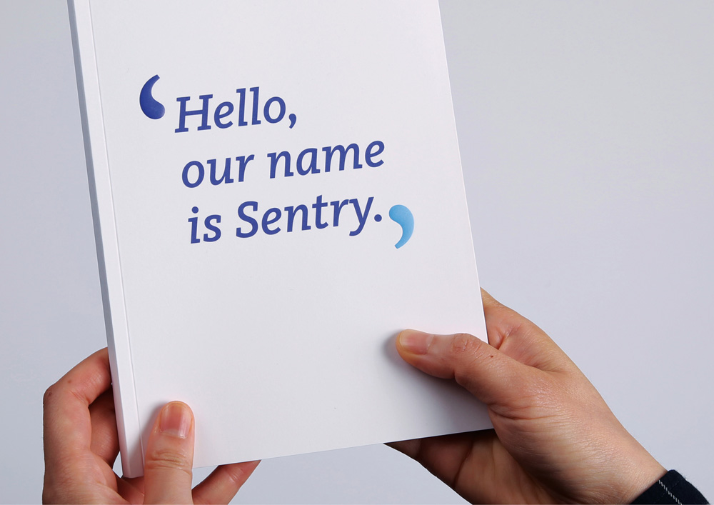
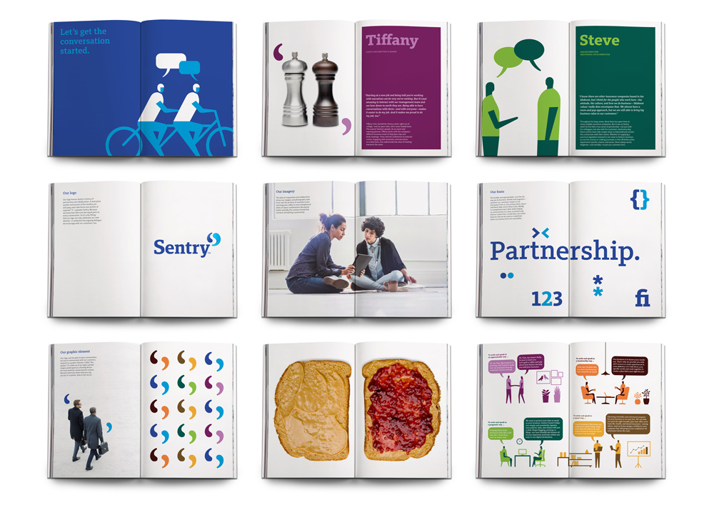
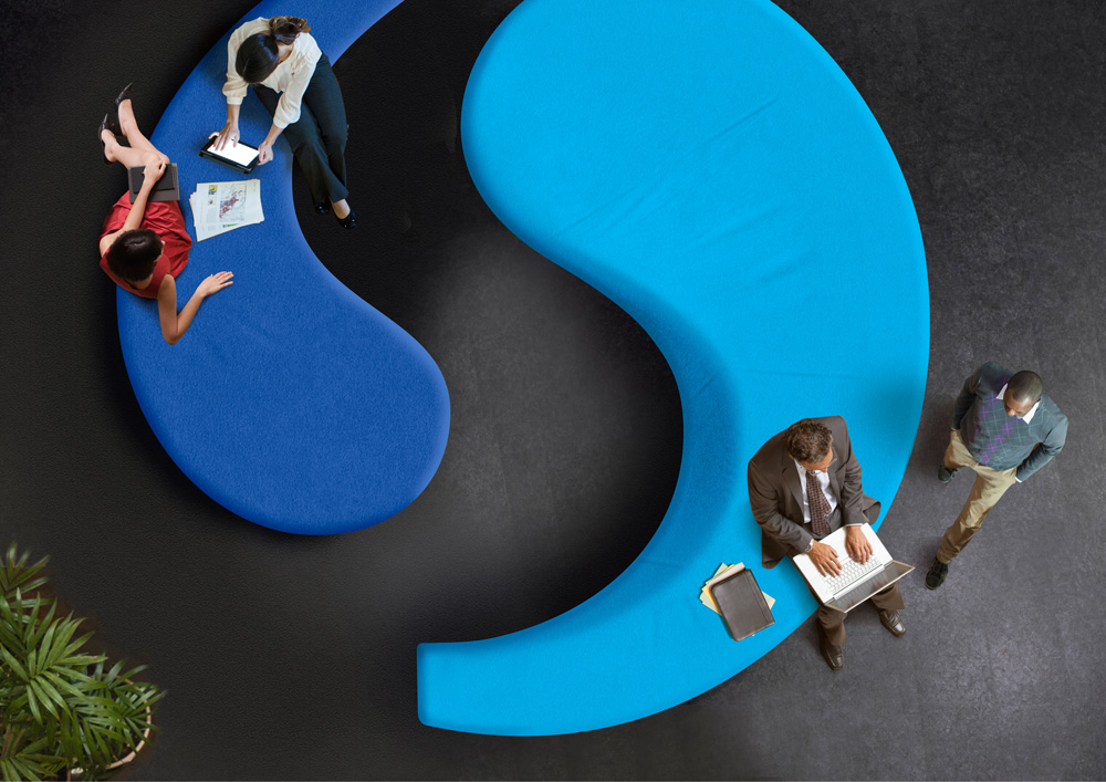
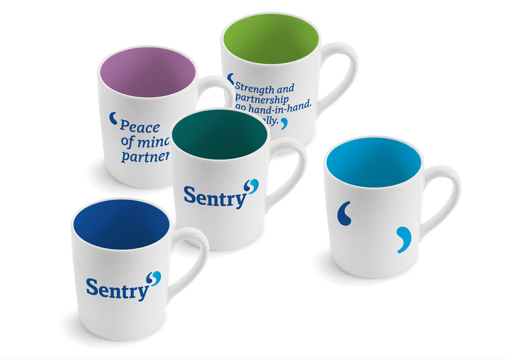
Our logo honors Sentry’s history of partnership and collaboration. A dual-piece symbol reminiscent of the timeless yin and yang, each side forms one section of a greater ‘S’–a greater Sentry. Because we know that there are two equal parts to every conversation. So it’s only fitting that our logo not only celebrates our own identity– it celebrates the ongoing dialogue we encourage with our customers, too.
Futurebrand provided text
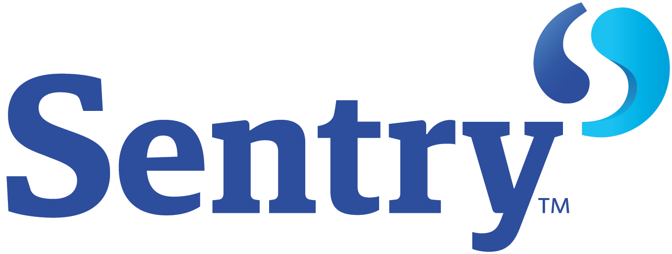
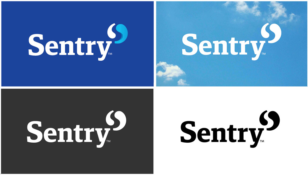
As I concluded in Friday’s post, the new logo is pretty good, solid, and relevant to the company while also not following today’s logo trends. The one thing I’m not sure about is whether it works better in its full rendering where the right quote mark shows some dimension or in its single color versions. While I’m usually all for simplicity, the shading does help add some life to the marks.
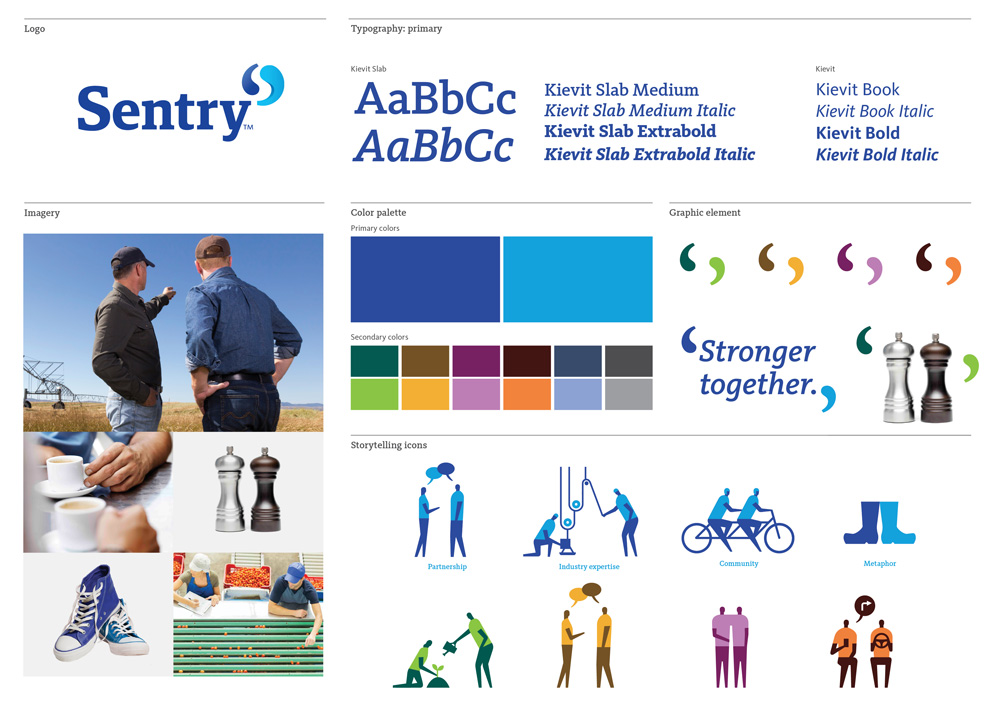
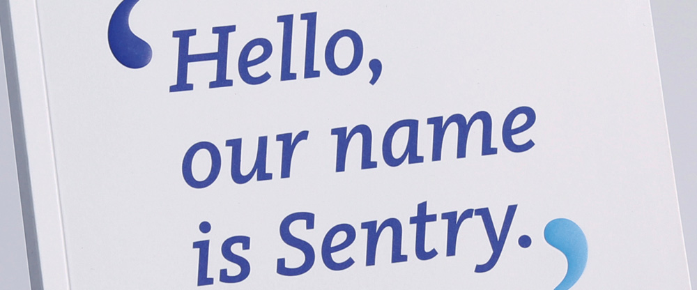
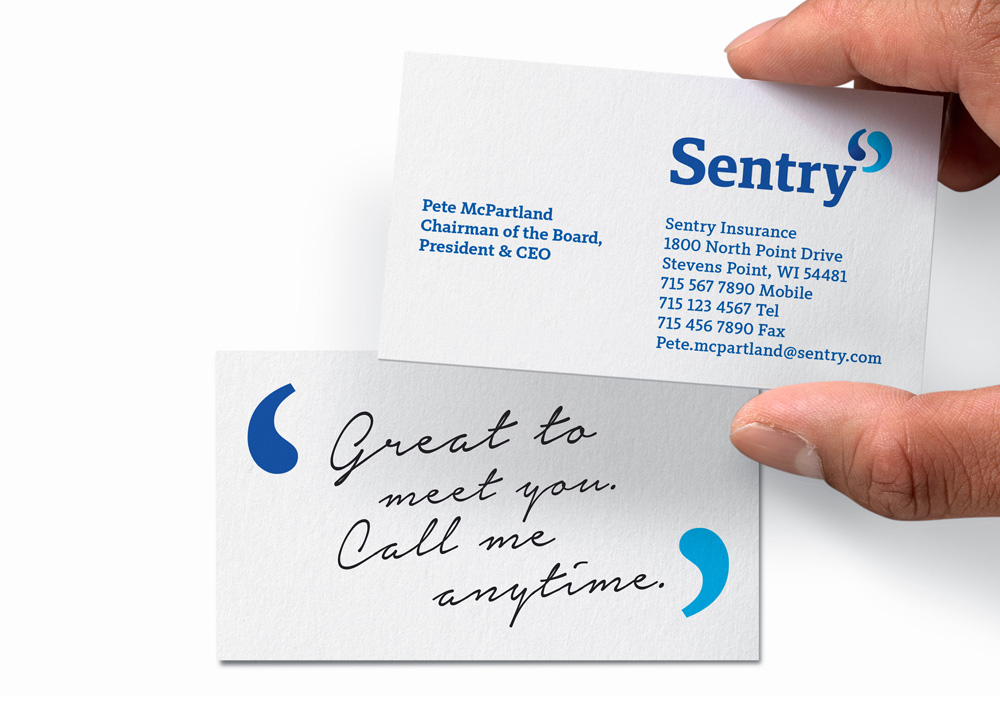
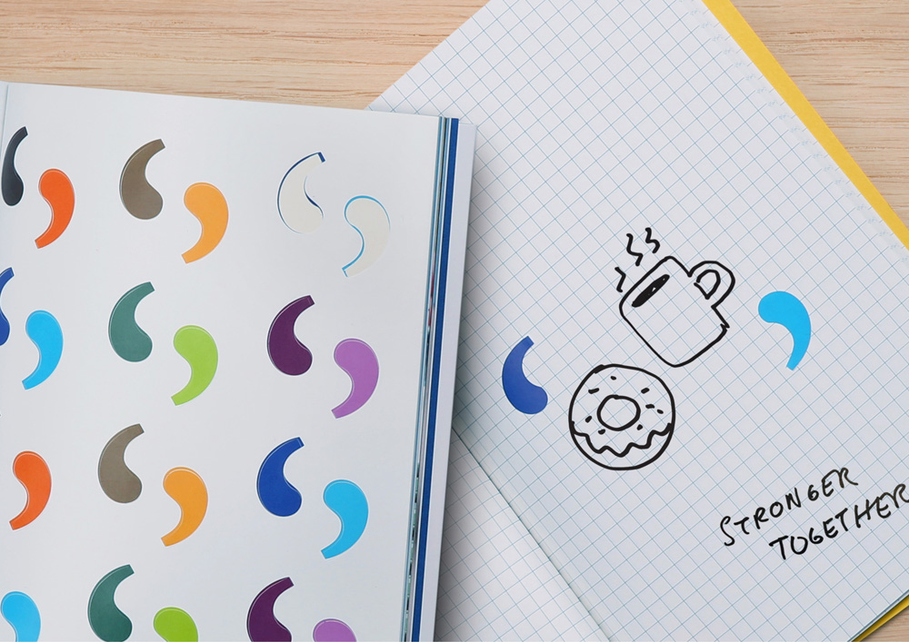
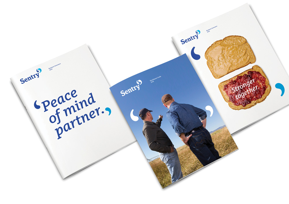
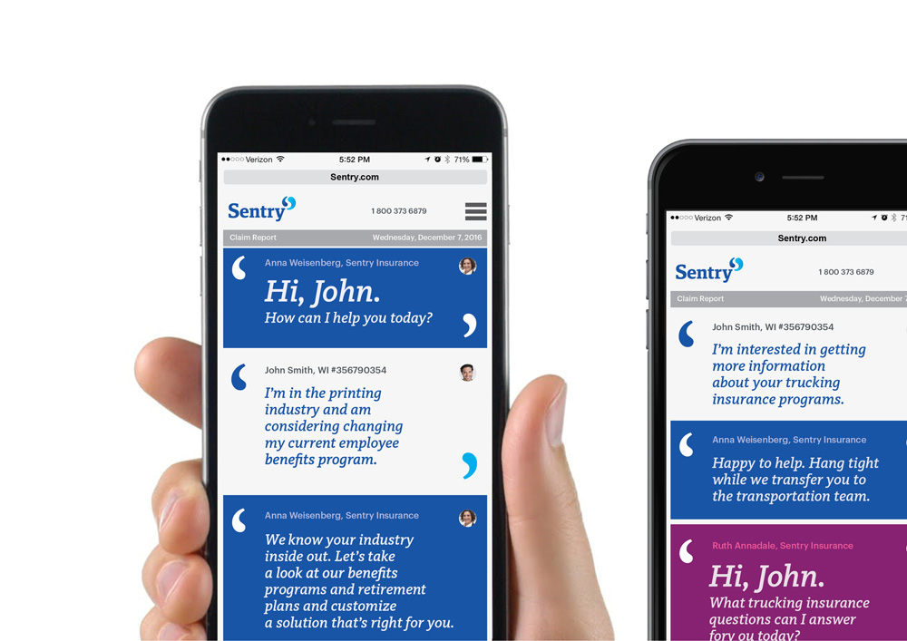
Our logo, and the peer-to-peer conversations we use to communicate with our customers, inspired our graphic element. Called “the quotes,” it’s made up of our logo’s symbol shapes pulled apart as a framing device for more emotive, conversational content. Because when you mean what you say, you put it in quotes. And on the record.
Futurebrand provided text
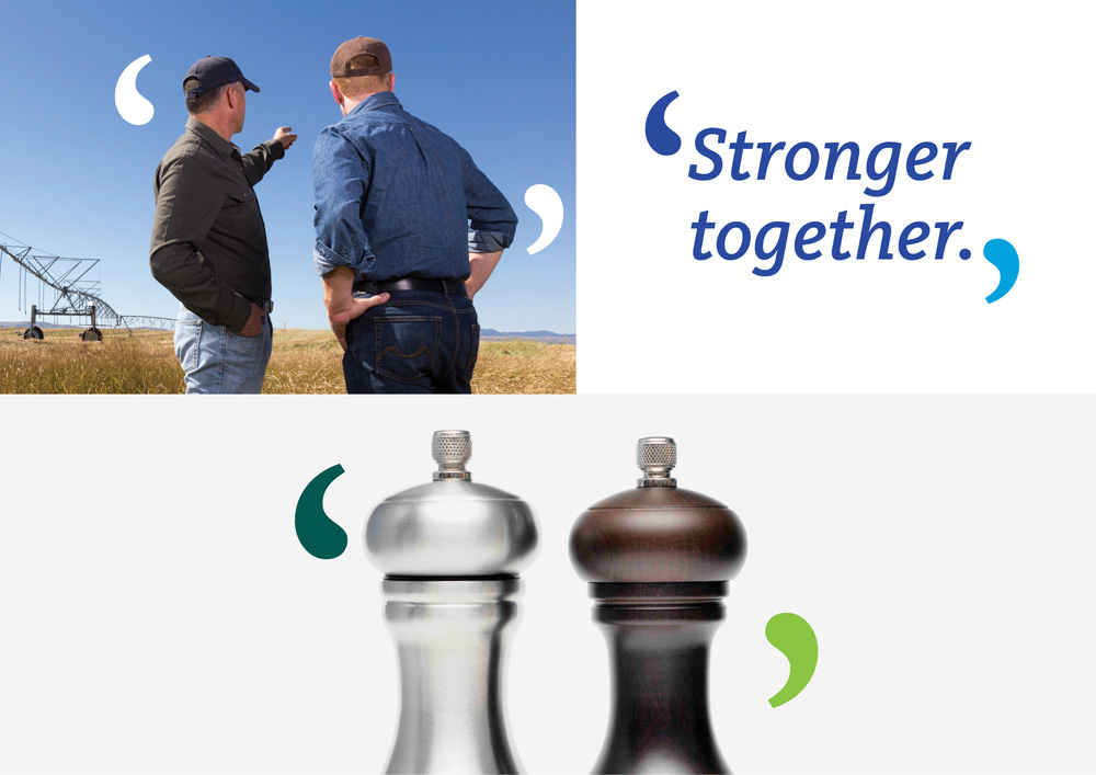
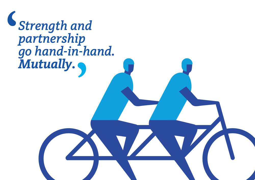
The “the quotes” are a good hook to build the identity around, providing a recurring visual device across materials. It’s a little corny when they are used with things like ‘salt and pepper’ or ‘peanut butter and jelly’ (shown a few images below) but it works better with photos of people or typography. It’s well managed how the “the quotes” are used larger in contrast to the logo so that they don’t feel so repetitive when they both appear in the same layout.
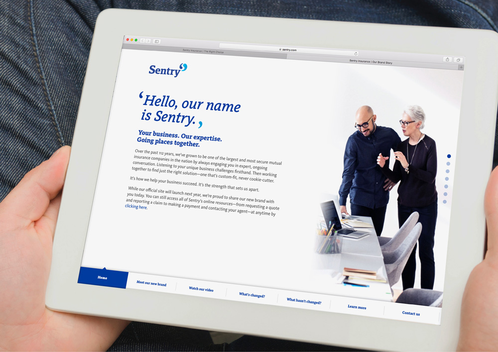
Overall, this is a solid corporate redesign that literally gives Sentry a new tone of voice that still feels corporate but that also demonstrates a specific outlook on how they do business and how they want to be perceived, instead of relying on the statue and image of a soldier to do it on their behalf.

Powered by WPeMatico