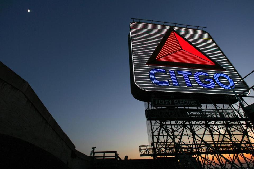
Great piece on the history behind Citgo’s logo, designed by Lippincott & Margulies in the early 1960s, and the famous 60-square-foot sign that sits in Boston’s Kenmore Square. Also of interest: the name Citgo was generated by a computer, selected from over 80,000 options stemming from the original Cities Service name.
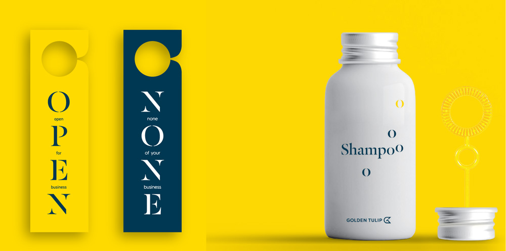
“The Golden Tulip hotels chain traces its roots back to the early 1960s, when the first Golden Tulip hotels opened their doors in the Netherlands. Since then, the chain of hotels has expanded across the globe, always in step with the changing needs and expectations of our customers. As part of the Louvre Hotels Group, the worldwide hotel chain operates three well-known hotel brands: Tulip Inn, Golden Tulip and Royal Tulip with a total of over 240 hotels in 45 countries. Each establishment combines the hotel chain’s commitment to high international standards with the unique personality of the people who manage it and the local flavour. The result is a stay as inspiring as it is pleasurable.”
Design by: N/A
Opinion/Notes: The old logo was literal in representing its golden tulip as, well, a tulip colored gold. It wasn’t the best tulip abstraction ever but it was nice and, more importantly, it felt like a hotel logo, or at least something in the hospitality realm, even like a golf course. The new logo is a clever representation of a tulip laying sideways and doubling as a “GT” monogram. But it might be too clever for its own good. The main problem is that tulips don’t lay sideways; tulips are upright in our minds. I realize logos aren’t meant to be literal but this requires one leap away from the association it’s trying to make. As a “GT” monogram, it’s almost there but trying too read the “G” as a “G” is far too painful. Still, I do think it’s a clever approach. The new wordmark is far from the “premium typography” the press release touts but at least it’s much better than the old one. What little is shown in prototype applications is not very promising and the use of the stenciled, disappearing serif is one year too late in the trend department.
Select Quote: Our new logo playfully represents a Tulip lying on its side. Our name, written in modern, premium typography, forms the tulip’s stem and our initials are hidden in the Tulip monogram.
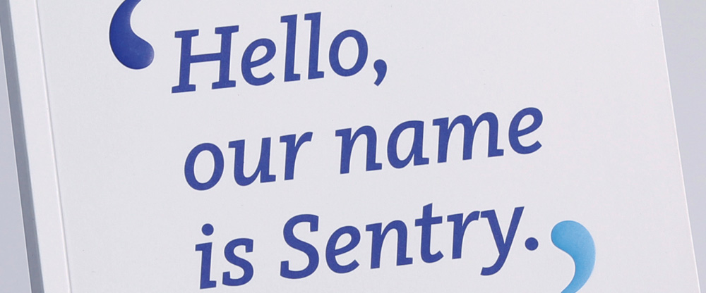
From last Friday’s Noted post on Sentry, it turns out there is a lot more to the story that wasn’t available for release. Here is a follow-up on the new identity from Futurebrand with plenty more images and concepts behind it.
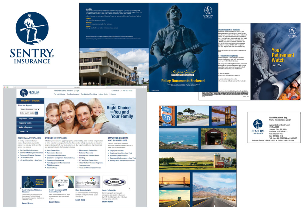
Sentry realized its brand was not an accurate reflection of who they really were and how they conducted business. The ideas of strength, protection and vigilance were table-stakes in the insurance industry. And the image of a solitary military figure holding a gun felt counter-intuitive to a brand whose core strength was found in the expert conversations it had with customers and the relationships it cultivated. The company’s identity felt too corporate, conservative, sometimes cold and out-of-step with the times.
Futurebrand provided text
Audit of old look.
So the white man with a gun is not just a random white man with a gun but Captain John Parker, who “rallied 77 fellow minutemen to face British troops in the first military encounter in America’s War for Independence” and represented the values of Sentry, “Strength, Protection, and Vigilance.” That’s a good back story for a logo but as the image above shows, not much of that was reflected in the materials that looked like default insurance materials. Also, anything with a page-curl effect has to be deleted from existing.
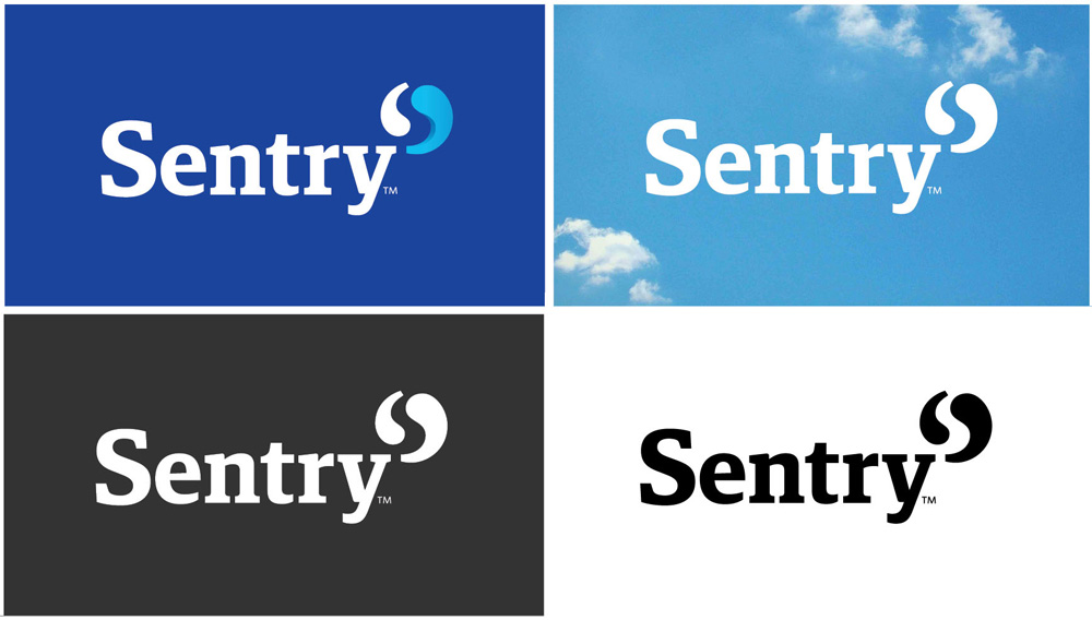
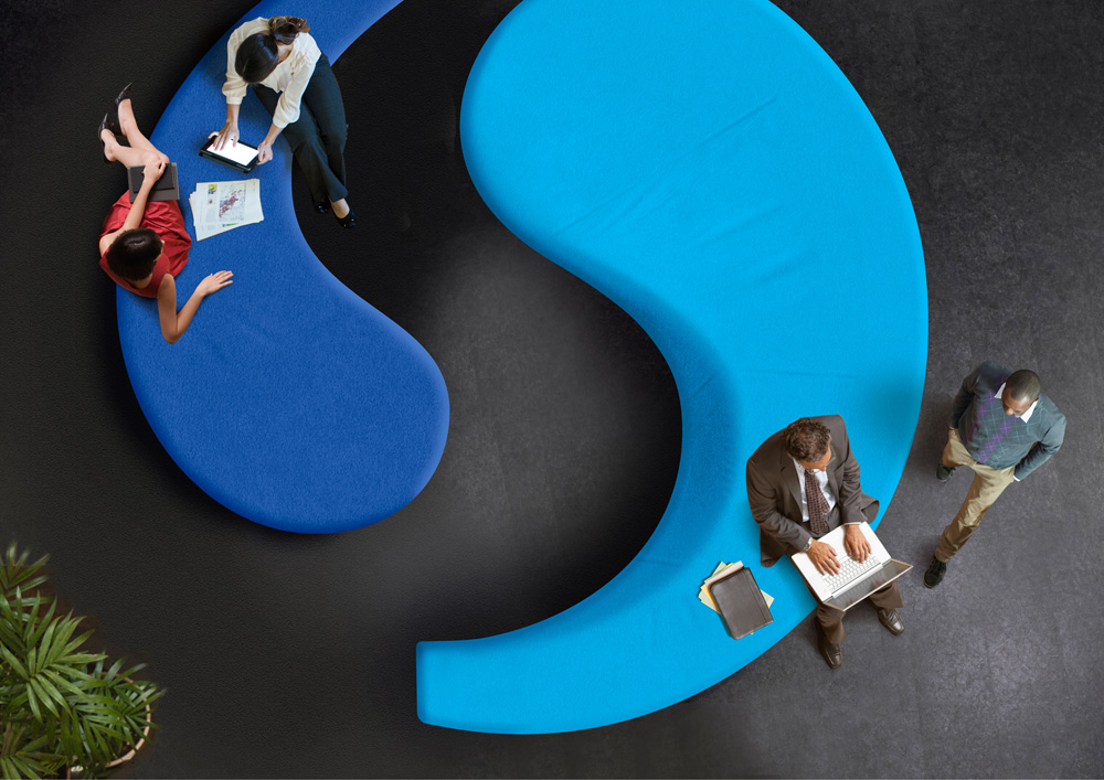
Our logo honors Sentry’s history of partnership and collaboration. A dual-piece symbol reminiscent of the timeless yin and yang, each side forms one section of a greater ‘S’–a greater Sentry. Because we know that there are two equal parts to every conversation. So it’s only fitting that our logo not only celebrates our own identity– it celebrates the ongoing dialogue we encourage with our customers, too.
Futurebrand provided text
Logo detail and color variations.
As I concluded in Friday’s post, the new logo is pretty good, solid, and relevant to the company while also not following today’s logo trends. The one thing I’m not sure about is whether it works better in its full rendering where the right quote mark shows some dimension or in its single color versions. While I’m usually all for simplicity, the shading does help add some life to the marks.
Identity elements.
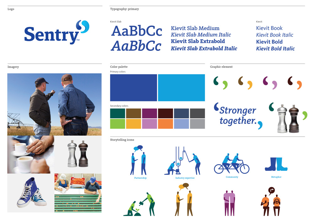
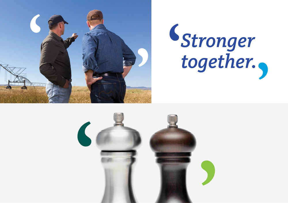
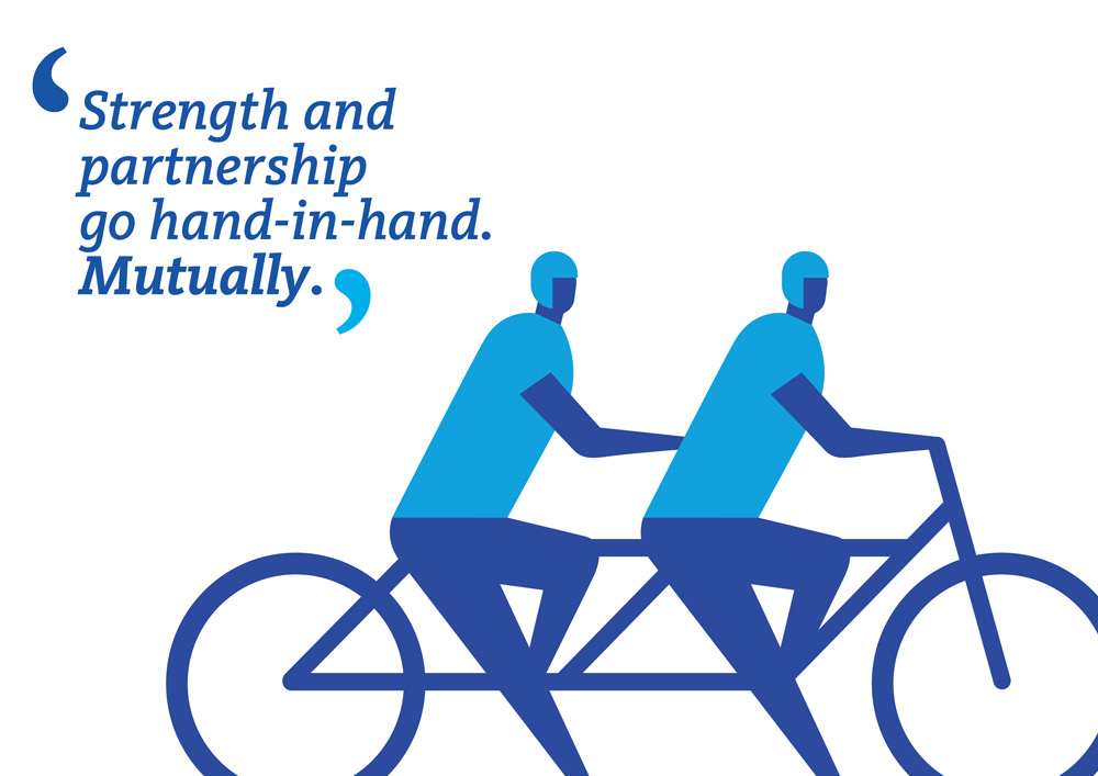
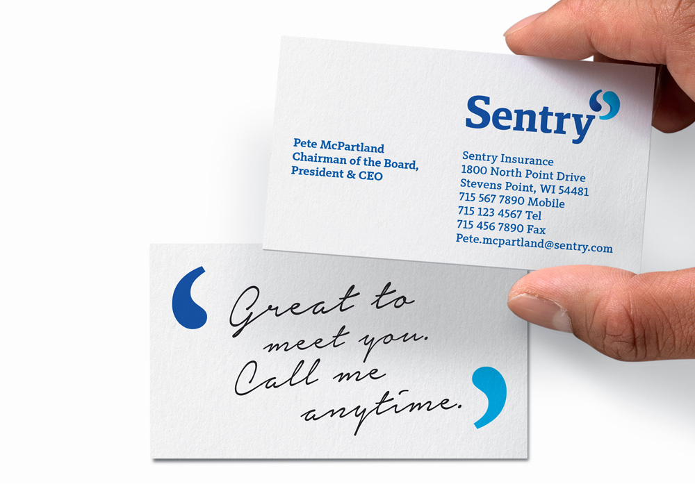
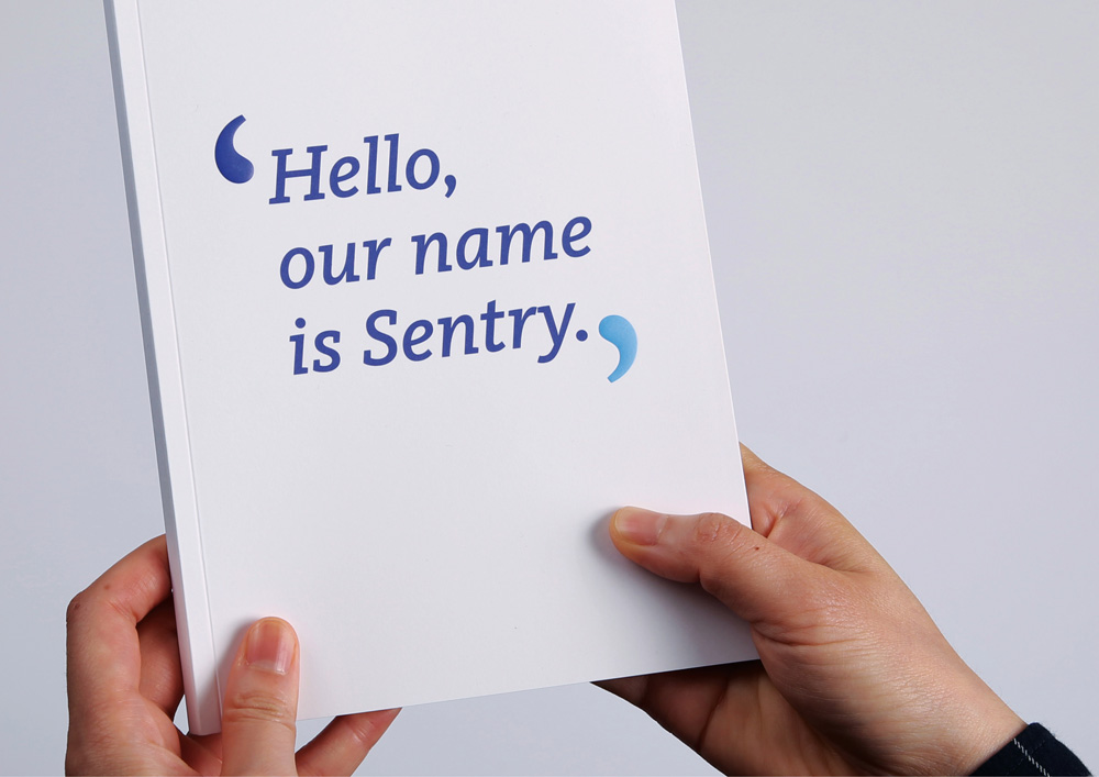
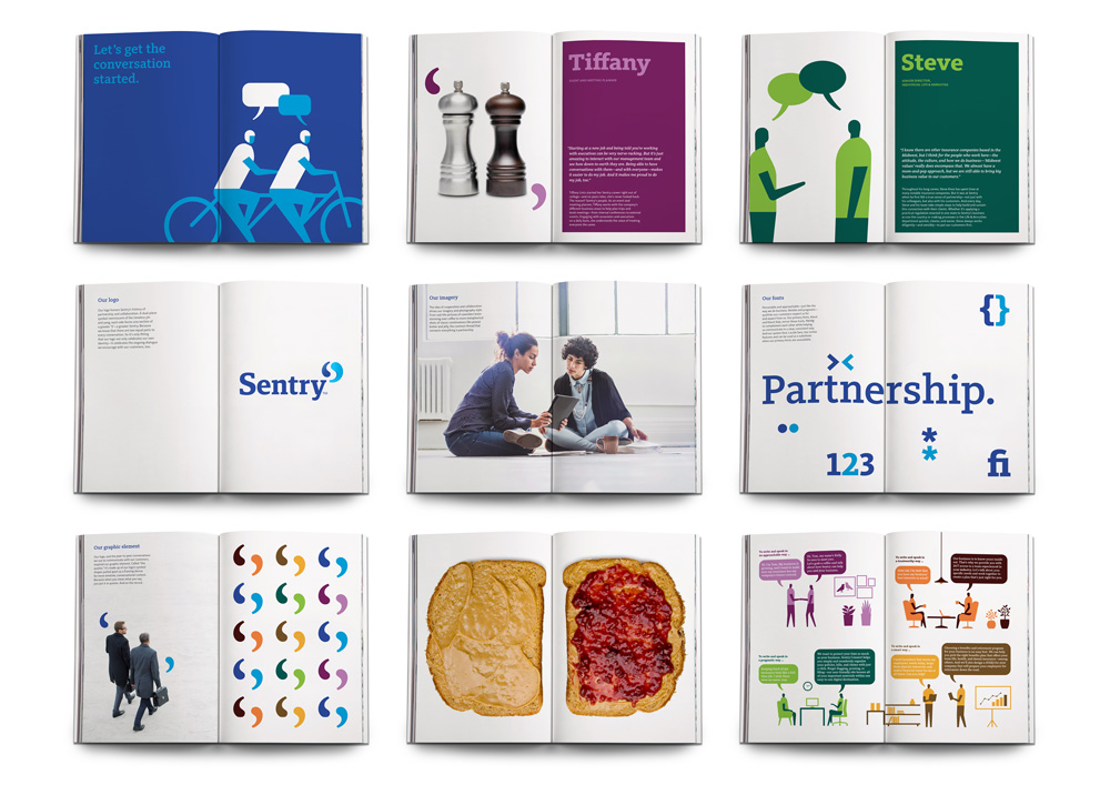
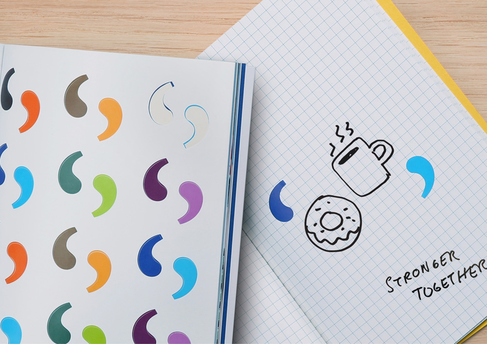
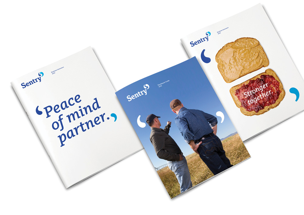
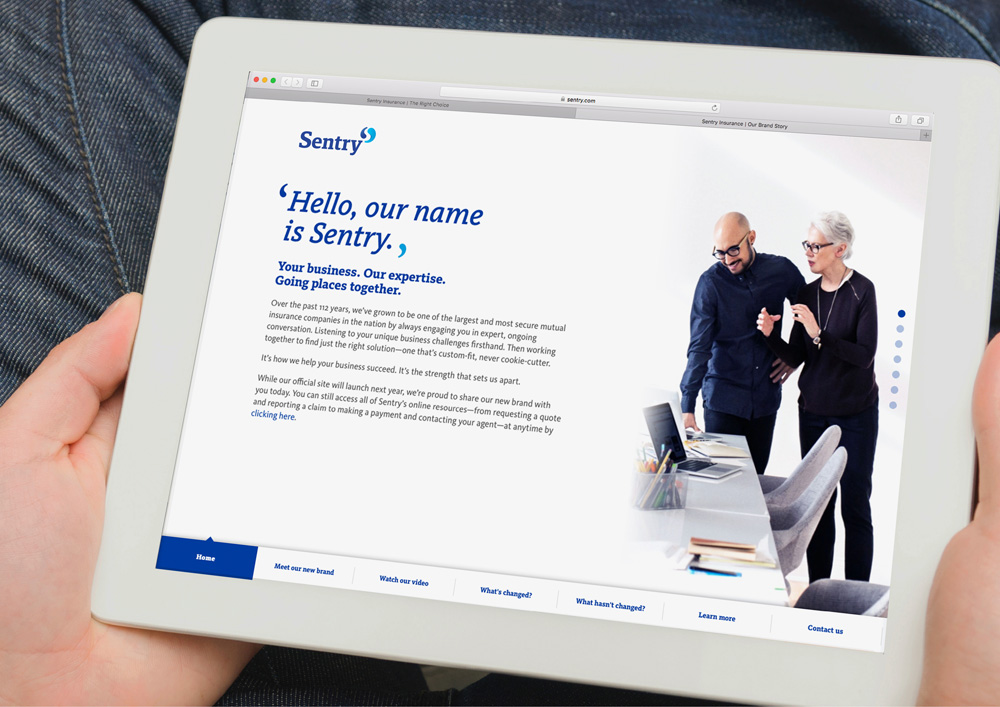
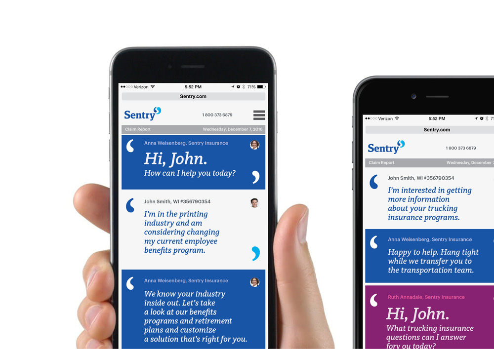
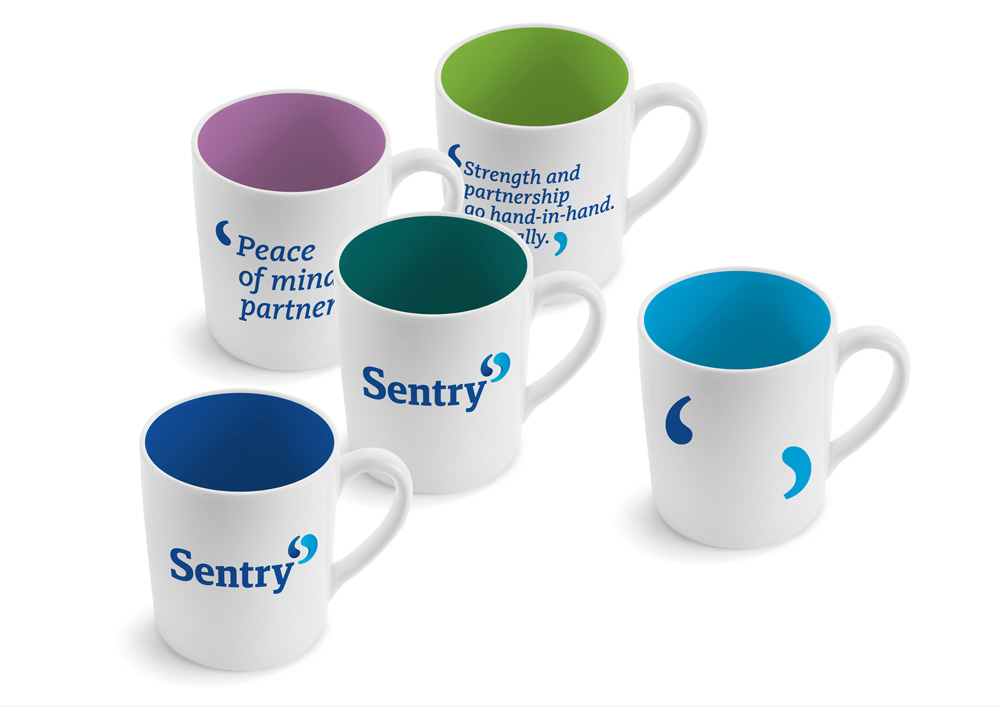
Our logo, and the peer-to-peer conversations we use to communicate with our customers, inspired our graphic element. Called “the quotes,” it’s made up of our logo’s symbol shapes pulled apart as a framing device for more emotive, conversational content. Because when you mean what you say, you put it in quotes. And on the record.
Futurebrand provided text
“The quotes”.
Business card.
The “the quotes” are a good hook to build the identity around, providing a recurring visual device across materials. It’s a little corny when they are used with things like ‘salt and pepper’ or ‘peanut butter and jelly’ (shown a few images below) but it works better with photos of people or typography. It’s well managed how the “the quotes” are used larger in contrast to the logo so that they don’t feel so repetitive when they both appear in the same layout.
Illustrations.
Brand book.
Stickers from brand book.
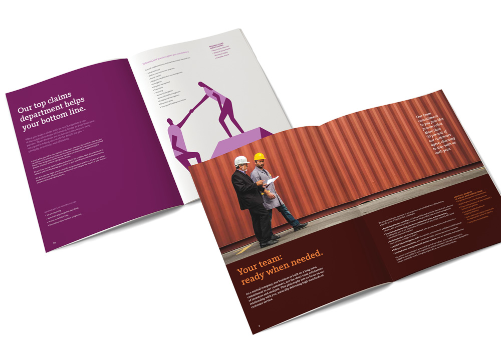
Brochure covers and spreads.
Website.Claim report app.Lobby seating.Mugs.
Overall, this is a solid corporate redesign that literally gives Sentry a new tone of voice that still feels corporate but that also demonstrates a specific outlook on how they do business and how they want to be perceived, instead of relying on the statue and image of a soldier to do it on their behalf.