
It Takes Two to Dialog
![]()

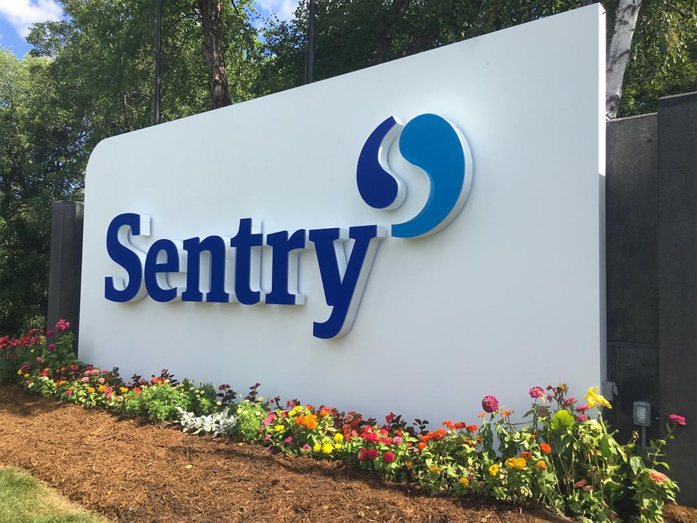
“Formed in 1904, Sentry is one of the largest and strongest mutual insurance companies in the U.S., holding an A+ (Superior) rating from A.M. Best. Headquartered in Stevens Point, Wisconsin, Sentry employs more than 4,000 associates across the nation. The company and its subsidiaries sell property and casualty insurance, life insurance, annuities and retirement programs for businesses throughout the country.”
Design by: Futurebrand
Opinion/Notes: The old logo took the company name to heart, depicting a sentry standing guard. As a drawing it was actually nice but, as a logo, I don’t think anyone wants an armed white man in theirs — I take that back, I bet there are a lot of companies who would loved and armed white man as their logo — or, worse, Trajan as their wordmark. The new logo does away with the literal Sentry and drops “Insurance” from the name, which makes it sound and look more contemporary from the get-go. Instead of Trajan, the new wordmark is set in a chunky serif with a Meta Serif vibe that is a great alternative for corporate typography to the current geometric sans rage. The icon is a yin-yang made out of single-opening quote marks that reveal an “S” in the counterspace. It’s a nice, simple gesture of an icon and is very well balanced and locked up with the wordmark. It manages to convey communication and collaboration without being too literal about and without the threat of a musquet.
Related Links: Sentry press release (PDF)
Sentry brand page
Select Quote: The new logo honors Sentry’s history of partnership and collaboration. The dual-piece symbol – reminiscent of the timeless yin and yang – represents the two sides of every conversation.

Powered by WPeMatico